4 Of The Best eCommerce Product Pages
The best ecommerce product pages provide ample information so that the shopper can make a purchase decision with high certainty.
Product pages across different companies’ websites run the full spectrum. Some create elaborate pages with video, animations and other moving parts. Other companies take a simple approach displaying product images and explanations why someone should buy it.
If you put yourself in the shopper’s place, you’ll better know how to create the best ecommerce product pages. For examples, online shoppers are mainly frustrated by the lack of product detail and sales assistance. This is particularly true when it comes to buying clothes online.
A size 8 from a budget store like Walmart will not fit the same as a size 8 from Bloomingdale’s. For this reason, including details about the fabric, showing 360 degree animations, and more is strongly recommended. That is, if you’re really wanting to be successful selling products online.
Examples Of 4 Best eCommerce Product Pages
In a word, the most alluring product pages are not always built with enterprise level programming. Unless you have an unlimited marketing budget, wasting such money will hit your profits hard. But wait, your website is new so you haven’t sold any products yet. Not to mention, you also have money tied up in inventory. See how quickly things can go wrong when you start out far beyond your means?
With this in mind, we want to show you what’s possible without breaking the bank. We selected a few of the best ecommerce product pages from small businesses as well as big brands.
Let’s check them out.
1. Thinx Leggings
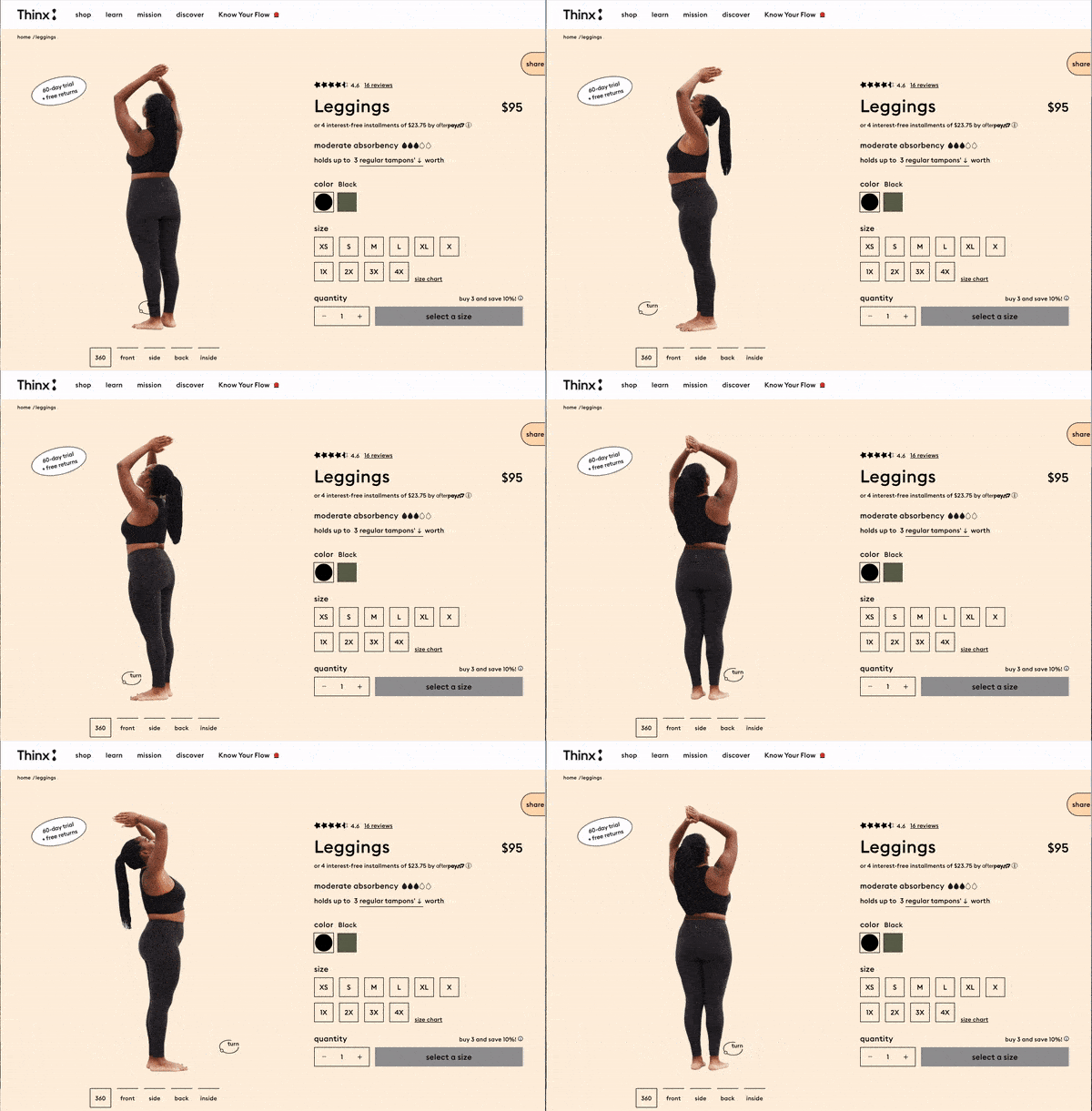
Thinx is an undergarment and clothing brand that makes absorbent products for people with periods. As an alternative to pads and tampons, their products are a long-lasting solution to menstrual products. Their products can also be worn with menstrual cups and tampons for extra protection if you so desire.
What Makes This Shop Special?
- Interactive 360 degree product feature. Customers can see exactly what to expect by spinning models of different dimensions.
- Displays a wide range of body shapes and sizes allowing customers to determine which looks best on different individuals.
- Clearly lets customers know which garment is best for them according to activity level and flow.
2. nfant® Nipple
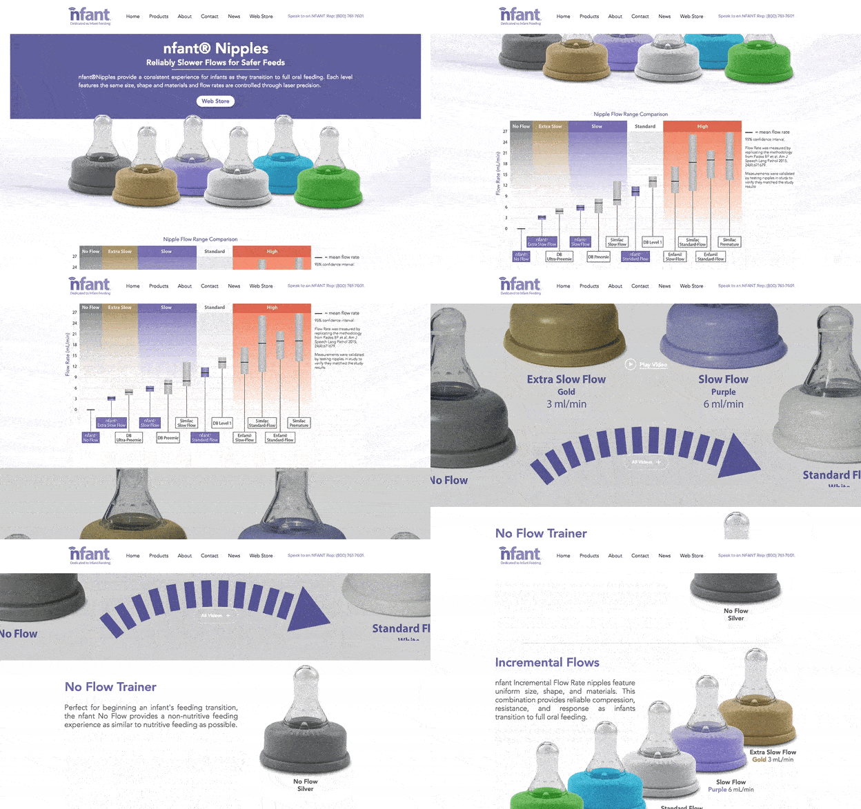
nfant® is an infant nursing product that helps moms transition from breastfeeding to oral feeding. As a small business, this site uses data well to attract customers. Obviously, this sets them apart from other parenting and nursing services. Additionally, the product page above displays several types of bottle top-shaped nipples. And each one offers a different level of flow when the baby is drinking.
Why Is This Store Special?
- Although the conditions of each product is involved, details are presented gracefully.
- Video demonstration, color coordination, and even a graph comparing each product’s flow range is used. Doing this provides useful information that mothers can refer back to.
3. Glossier ‘Find Your Shade’
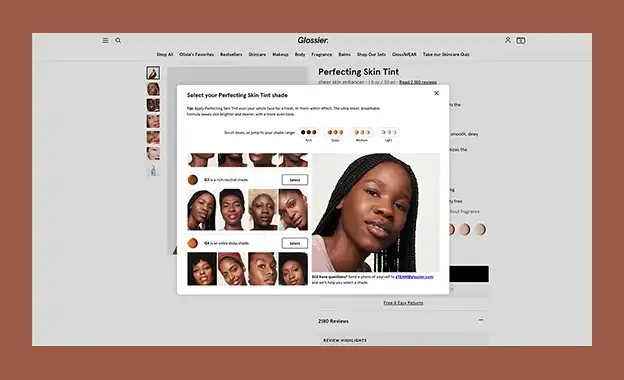
Glossier is a beauty and skincare brand. They offer a unique functionality that allows customers to ‘Find Your Shade’ of concealer or foundation. For instance, users can select their skin tint shade based on real life examples. By showing their product in action, Glossier decreases the risk to customers. Thus, leading them towards a successful conversion instead.
What Makes This A Great Store?
- Product videos showing the application in action.
- ‘Save with sets’ featured on the product page, as well as at checkout to upsell.
- Helpful ‘Find Your Shade’ feature, as well as dynamic photography depending on the shade selected by the potential customer.
4. Black Bloom Studio – Deposit
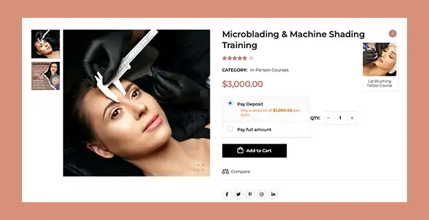
Black Bloom Studio is a cosmetic tattoo studio located in Austin and San Antonio, Texas. They offer microblading, lip blushing and other cosmetic tattoo services as well as training. However, the training courses are several thousand dollars. By offering a flexible ‘deposit’ functionality, users are able to secure their place in the course. Potential students also have the option to pay for the course training in full. Learn more about Black Bloom Studio in our web design portfolio.
Why This Is A Great Product Page
- Deposit functionality gives users the flexibility to secure their seat in the course.
- The product page features all relevant product information to make an informed purchase.
- At top right of product, users can view other available courses without ever leaving the product page they’re on.
- Product reviews functionality increases credibility.
Wrapping It Up
The best ecommerce product pages are intuitive and features information that reduces uncertainty. But you don’t need to overwhelm users. Instead, streamline the key facts, make it fun and convenient.
You may also enjoy reading: How Keyword Cannibalization Effect Your SEO

Dr. Amelia Davis
WEB DEVELOPMENT DIRECTOR
Dr. Amelia Royster-Davis is a Doctor of Education and an Instructional Designer. As the Director of Web Development at Envisager Studio, her primary focus is to lead the web development team in building modern, responsive websites. In her spare time, she writes about web development, UI and UX.


