Clean Web Design Is Like Having A Clean Office

Envisager Studio’s clean web design has set a new benchmark for website designers in San Diego. Our San Diego website design service is performed by a team of talented and skilled professionals.
If you’re thinking that a clean design doesn’t demand hard work, you’re mistaken. In fact, clean designs can sometimes require more skill than it does for a fully animated website. So, let’s get better clarity about creating a clean web design.
Why You Need A Clean Web Design
A neat and clean web design is easier for the human eye to scan. Additionally, a neat interface not only helps the user to maintain focus, but it also reduces cognitive workload. Plus, page load time and conversion rates are historically better in a clean website design.
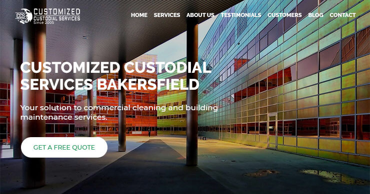
Clean Website Design Header
While using multiple images with animated content for the header looks great, it can also slow down your website. And with Google’s mobile first indexing, consideration must be given to mobile users.
Clean web design is like having a clean office. When there’s lots of paper clutter and other visual distractions, it’s difficult for staff to focus on work. Instead, when you walk into an office, you should be able to clearly see where you’re going. And the Customized Custodial Services website header above is a perfect example of clarity. It is a visually appealing, static image containing a call-to-action that’s ideal for all devices.

Page Layout For Website Designers in San Diego
Website designers in San Diego know that getting the page layout right is important. It is also a consistent attribute of clean web design based websites. The grid structure dictates the placement and scale of the elements.
Janitorial services websites such as commercial office cleaning require an uncluttered grid arrangement. Otherwise, service offerings can often blend into regular content. Thus, injecting unnecessary chaos. When creating clean web design, San Diego website designers suggest suggest pay attention to page layout structure first. Then, focus on other critical elements.
Typography For Clean Web Design
Typography is just as important as the layout structure. Using many different typefaces not only creates disorder in the design, but it also confuses the reader. Instead, website designers in San Diego uses a maximum of two typefaces.
For emphasis and other goals, consider using different sizes and colors of the same font. Of course, these colors should always be your brand colors to ensure continuity. And don’t forget about spacing. To ensure high readability, especially for lengthy content, appropriate spacing is crucial.

Website Designers in San Diego Create Clean Navigation
Navigation is a key component of a clean and neat website design. And professional designs will always have intuitive navigation that guides the website visitor. But in order to maintain a clean website design, navigation should have:
- Clickable links – Some websites have static links that when clicked, only accesses the subcategories. Usually, this is because having a page for the category would be duplicate of the subcategories. Nonetheless, ensure that categories and subcategories are clickable.
- Distinctiveness – Using a sidebar navigation is ideal for service pages. In addition to keeping the visitor focused on your services, it lets them know where they are on your site. Additionally, categories and subcategories links for all navigation should be clickable.
- Footer menu – Having a ‘back to top’ clickable text or image is useful in the footer of the site. Although visitors can use the browser scrollbar or fingers on mobile to scroll up, the clickable link is faster. Also, consider placing other important elements in the footer section such contact and social media.

Website Designer in San Diego uses White Space
If you’re a website designer in San Diego, chances are your clean web designs makes use of white space. Unnecessary elements and improper spacing creates clutter. Plus, white space has a strategic purpose. After all, you want want visitors to focus on the important information. And you also want them to see and take the desired action for your call-to-action content.
For a professional website, a minimalistic approach is the best way to express the brand’s message. However, this doesn’t necessarily mean a minimalistic layout (narrow design).

Dr. Amelia Davis
WEB DEVELOPMENT DIRECTOR
Dr. Amelia Royster-Davis is a Doctor of Education and an Instructional Designer. As the Director of Web Development at Envisager Studio, her primary focus is to lead the web development team in building modern, responsive websites. In her spare time, she writes about web development, UI and UX.
