Web Content Above the Fold – Myth or Fact

Web content”Above the Fold” is a relic term that originated from the placement of stories in newspapers, which are typically folded in half. The stories that are above the fold are considered to be of greater importance because they are the first articles readers will see when purchasing a newspaper.
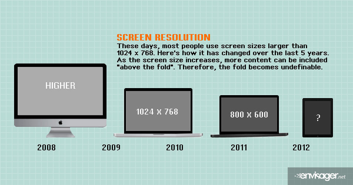
When in reference to a web page, the actual area that is above the fold is up for debate and the question arises, which fold? Given that some websites are designed to be responsive, where content appears depends on what device the reader is using. Furthermore, given that we’re in a multi-screen world, the idea of keeping web page content above the fold is pretty much meaningless.
It’s 2014 – there is no standard monitor size, and the fold on a mobile website is different than the fold on a desktop computer. Also with track pads and mouse wheels, scrolling has become much easier and viewing content below the fold is more accessible. And, how do you know placing the content where you think is above the fold will have any effect on the power of your message?
Believe or not, there are actually tools that create analytics that show which parts of a website are most visited. Chartbeat is the newest software that can track user engagement on websites. Chartbeat’s recent online study showed that 65% of viewers’ engagement time happened below the fold. The results appear to coincide with today’s web design trend: long, clean, scrollable pages.
However, if visitors are getting lost on your site because they can’t find the content they’re looking for, that can have a negative impact on your call-to-action. Basically, it best to hire a professional web design company who knows how to engage the user and make their viewing experience as efficient as possible. If a website visitor gets lost or confused, the call-to-action is not met.
In summary:
[custom_list style=”list-9″]
- Today’s users actually spend more time viewing web content below the fold.
- Multi-platform website viewing makes defining the fold more ambiguous.
- Forcing content above the fold can compromise the message if the user experience or call-to-action is poorly executed.
[/custom_list]
With modern technology, evolving design, and multi-viewing platforms, it has become less important what content the visitor first sees and more important how effective the call-to-action is. We’re not saying it’s important to have all your content below the fold, but rather content management and user experience should have high priority.

Hazel Burgess
FOUNDER/SEO DIRECTOR
Hazel is the Founder & SEO Director at Envisager Studio, a premier website design agency specializing in WordPress website design, development and internet marketing. In her spare time, she writes about search engine optimization, website design, and internet marketing.


